Types of Question
- Line Graph
- Bar Chart
- Pie Chart
- Table
- Map
- Process Chart
- Mixed/ 2 infographics
Example Questions


Key Info
Time: 20 minutes
Word Requirement: 150 words (Aim for 170-190 words)
Number of Paragraphs: Usually 3 or 4, but it can be 5 if that works better.
Scoring: Task 1 is worth 33% of your writing mark. The examiner will mark you based on: Task Achievement, Coherence & Cohesion, Vocabulary and Grammar.
Structure
1st Paragraph: Introduction + Overview (Trends/ Big Picture/ General Direction)
2nd Paragraph: Details 1
3rd Paragraph: Details 2
———————- OR ———————-
1st Paragraph: Introduction
2nd Paragraph:Overview (Trends/ Big Picture/ General Direction)
3rd Paragraph: Details 1
4th Paragraph: Details 2
Example

")
")
")

What NOT to do
1) Do NOT add a conclusion
You are required to only report, not draw conclusions.
2) Do NOT quote figures in your overview paragraph
(e.g. The UK ‘s GDP increased to 2%, while France’s dropped by 1%.) Instead, write: The UK’s GDP increased, while France’s decreased.
3) Do NOT write generally in your details paragraphs
(e.g. The UK’s GDP increased from 1940 to 1950.) Instead, write: The UK’s GDP increased significantly from £1 billion in 1940 to £1.2 billion in 1950.
How to Paraphrase


Paraphrasing Options


Good v Bad Paraphrasing


Common Main Trends You Should Look Out for


Tips


Imagine the Following

Imagine your job is to describe the main trends, similarities, differences or stages of an infographic to someone who is blindfolded.
Would that blindfolded person have a good understanding of what’s going on in the infographic?


Don’t forget the data points!!
Although you shouldn’t mention absolutely every single detail, it is important to back up your observations with data.
Aiming for 8-10 data points is a good target to ensure this. Keep in mind though that not all infographics will have a huge amount of data. So, adjust sensibly.
Look at the example to the left: there are 4 data points per paragraph backing up the observations.
| Verb | Noun |
| Rise | a rise |
| Increase | an increase |
| Grow | growth (mostly uncountable)/ a growth (specific instances) |
| Climb | a climb |
| Boom | a boom |
| Peak | a peak |
| Go up | N/A |
| Skyrocket | N/A |
| Verb | Noun |
| Drop | a drop |
| Decrease | a decrease |
| Decline | a decline |
| Dip | a dip |
| Go down | N/A |
| Fall | a fall |
| Reduce | a reduction |
| Plummet | N/A |
| Verb | Noun |
| Stay the same | N/A |
| Remain stable | Stability |
| Remain steady | N/A |
| Maintain the same level | N/A |
| Not change | No change |
| Remain constant | N/A |
| Verb | Noun |
| Fluctuate | A fluctuation |
| Oscillate | N/A |
| To be volatile | Volatility |
| Adverb | Adjective |
| Dramatically | Dramatic |
| Sharply | Sharp |
| Enormously | Enormous |
| Steeply | Steep |
| Substantially | Substantial |
| Considerably | Considerable |
| Significantly | Significant |
| Rapidly | Rapid |
| Moderately | Moderate |
| Gradually | Gradual |
| Slightly | Slight |
| Minimally | Minimal |


- 1st 5 Mins: i) Read & Understand the question ii) Write the introduction by paraphrasing the question
- 2nd 5 Mins: Find 2 main trends/ features and write a sentence each about them. (You can think of this as the ‘big picture’ or ‘what’s generally going on’ or ‘the big similarities and differences’ or as a primary trend and a secondary trend.)
- Next 8 Mins: Write 2 details paragraphs. Make sure to split the data logically.
- Final 2 Mins: Check/ Upgrade your work (Correct Spelling, Good Linking, Appropriate vocabulary, Punctuation etc).
Now Practice!
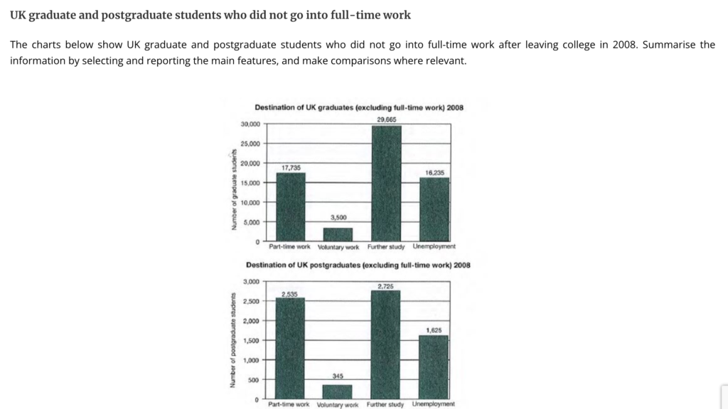
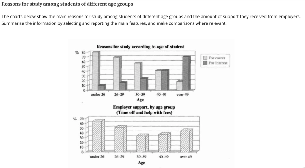
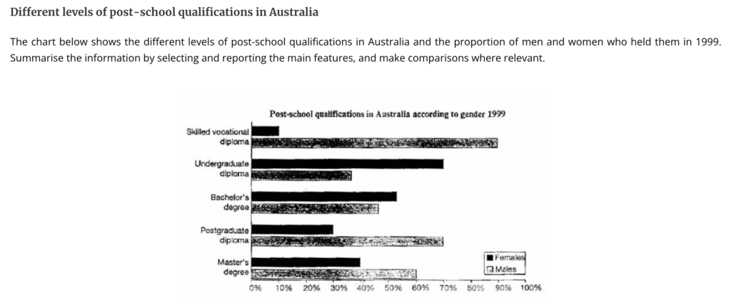
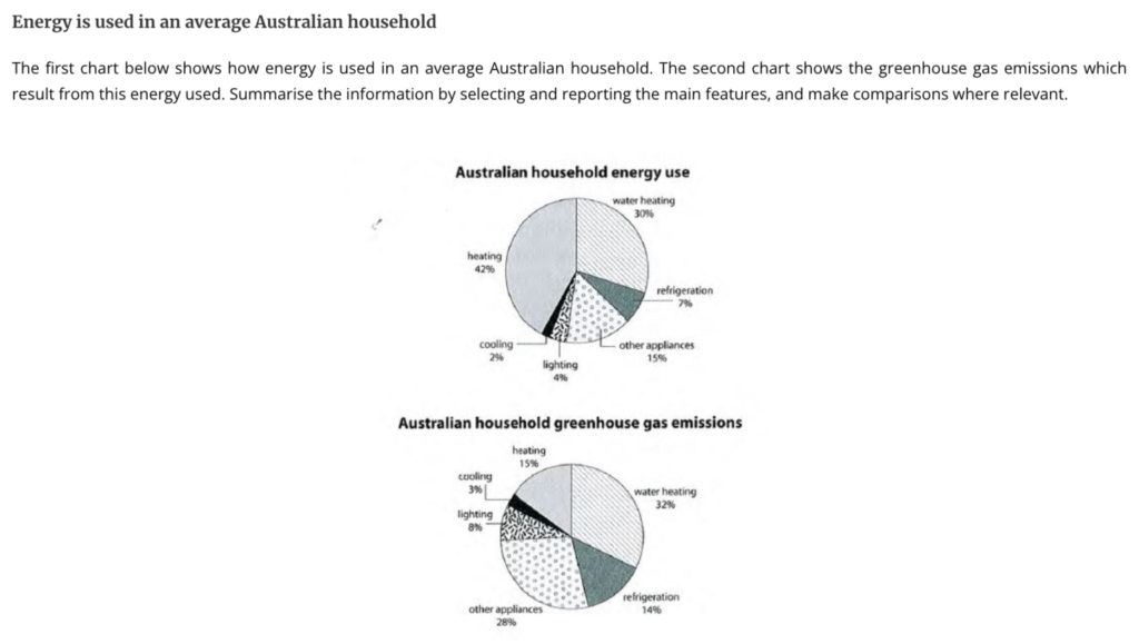
Check out the practice questions below or download the pdf here.


Band 7 Sample Answer
Band 9 Sample Answer


Sample Answer
The two charts given show the breakdown of how much energy is consumed and how much greenhouse gas emissions are produced by each utility in a typical Australian home.
Overall, while general heating takes up the most energy by far, its carbon footprint is quite low comparatively. Other appliances, refrigeration, lighting and cooling, on the other hand, produce noticeably disproportionate levels of greenhouse gases.
Looking first at energy consumption, heating and water heating together make up a significant 72% of the total. Other appliances and refrigeration contribute moderate proportions, at 15% and 7%, respectively. Finally, lighting and cooling account for the smallest share, using only 6% combined.
Turning to greenhouse gas emissions, water heating is the largest contributor, responsible for around one third of the total. Other appliances follow closely at 28%. Refrigeration ranks next, though at a much lower level, producing 14% of emissions. Finally, lighting and cooling generate the least, at 8% and 3%, respectively.
Sample Answer
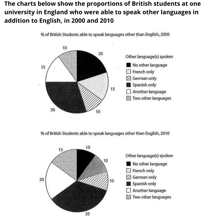
The pie charts given show the breakdown of what languages British students were able to speak other than English in the year 2000 and 2010.
Overall, Spanish dominance and multilingualism were the main trends seen. Spanish was the most dominant second language spoken in both years and even grew in popularity over the decade. Meanwhile, students able to speak one or two other languages became more common, while monoglots declined.
In 2000, nearly one third of the students spoke Spanish as their second language, making it the most popular choice. French was the second most spoken, with 15%. German as a second language was less commonplace, with only 10% speaking it after English. As for other languages, a quarter either spoke one additional language (15%) or two additional languages (10%). Finally, one fifth could only speak English.
Ten years later, Spanish speakers and students learning one or two additional languages grew by another 5% each. This meant that the vast majority (90%) of the students could speak another language other than English. German speakers remained a steady minority at 10%, but there were 5% less French speakers than a decade ago.


Sample Answer
The bar graph shows one particular nation’s revenue generated by various products in the year 2015 and 2016, while the table shows how much each changed in percentage terms between those years.
Overall, the country improved their earnings on all of their exports except gems and jewellery. Their main earners for both years were petroleum products and engineered goods, and although it brings in the least amount of money for the country, textiles saw the biggest relative increase in revenue.
The leading export, petroleum products, earned $60 billion in 2015 and remained a key contributor the following year, rising by 3%. Engineering goods, the second-largest export in 2015 at just under $60 billion, experienced stronger growth of 8.5% in 2016 and surpassed petroleum products, generating over $60 billion.
Gems and jewellery were mid-level earners, bringing in around $40 billion in 2015; however, their revenue fell by approximately 5% in 2016. Agricultural products generated almost the same value in both years, at about $30 billion. Finally, textiles were the smallest contributor in 2015, at just over $25 billion, but recorded the most notable growth in 2016, rising by 15% to reach a level comparable with agricultural exports.